
When I first started dreaming up the vision for our wedding, I knew I wanted it to feel timeless. The Vision: Soft, Romantic & Personal. I pictured a palette of white and gold — classic, elegant, and rooted in a style that would never feel dated in photos years from now. But as I dove deeper into planning (and started layering in cultural and design elements), that vision beautifully evolved.
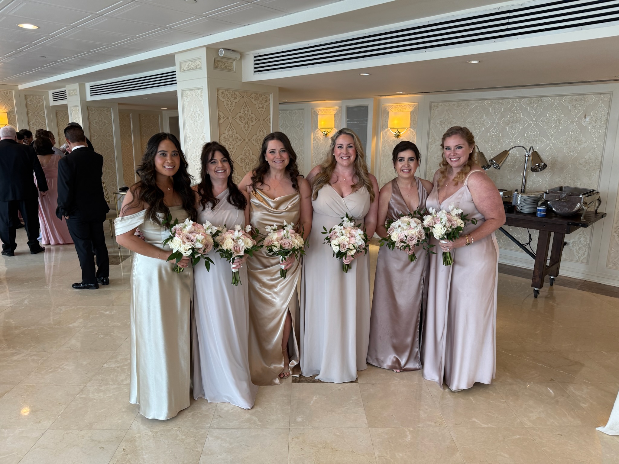
From the beginning, I knew I didn’t want my bridesmaids in matching dresses. Instead, I was drawn to the effortless beauty of mismatched neutrals — flowing gowns in a mix of soft tones and luxurious fabrics, like chiffon and satin. I wanted the final look to feel cohesive, yet unique to each of the amazing women standing beside me.
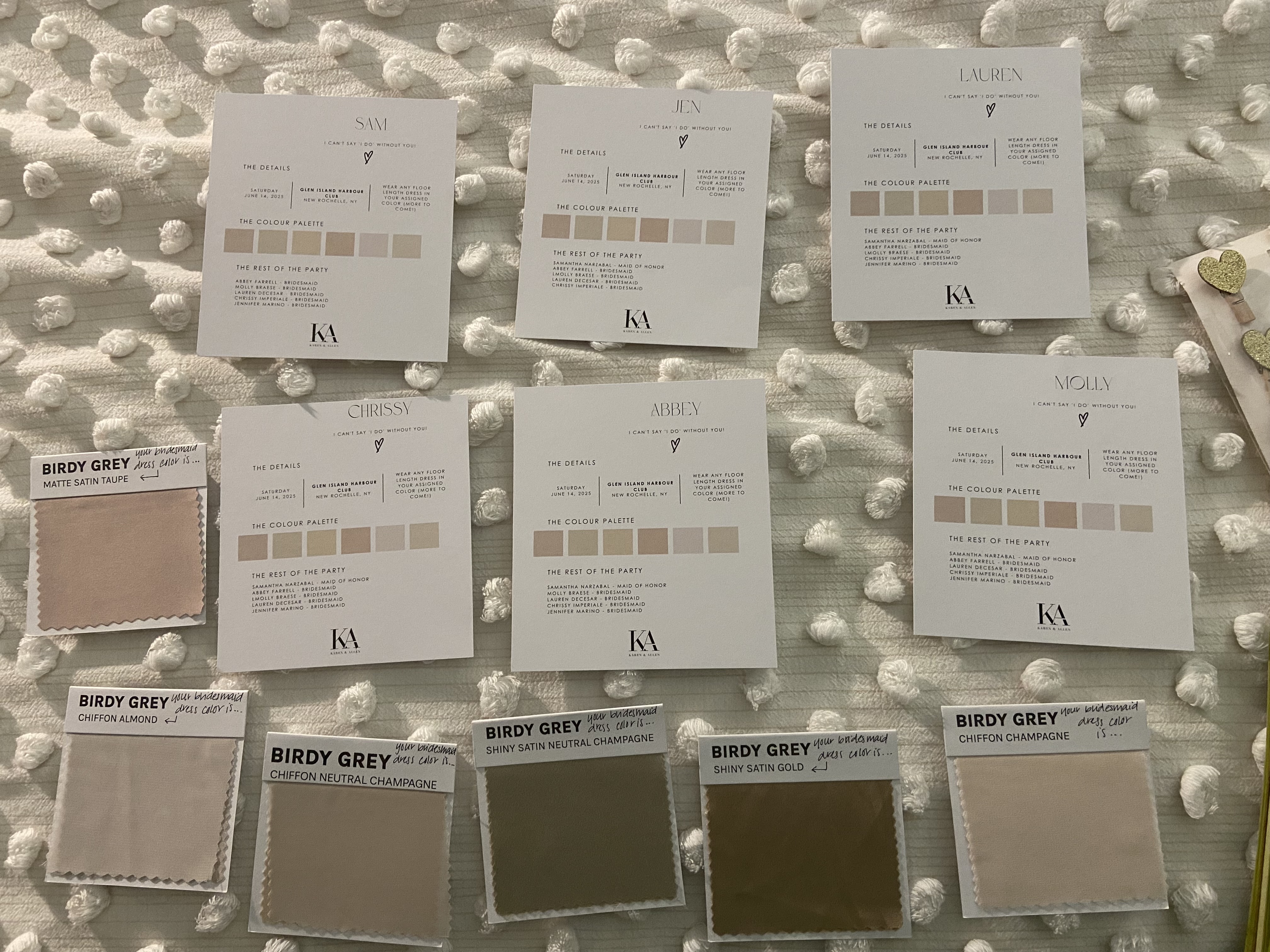
To bring this idea to life, I ordered a variety of fabric swatches from Birdy Grey. This step made all the difference — it allowed me to see how the colors and materials complemented each other in real life, not just online. More importantly, I was able to match each bridesmaid’s swatch to her skin tone, which made the final look feel intentional and flattering for everyone.
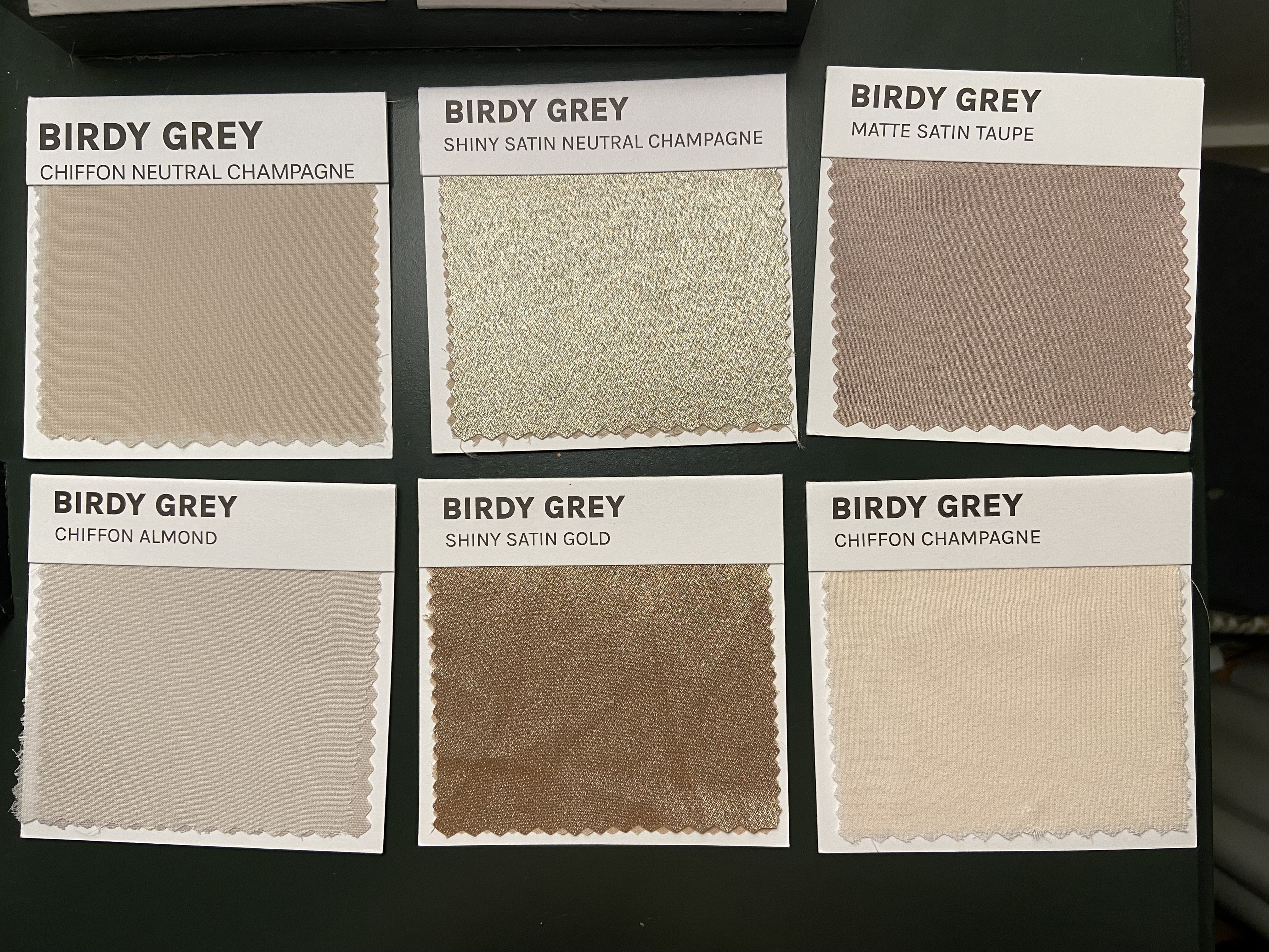
Once I had selected the color and fabric for each person, I included their personalized swatch in their bridesmaid proposal box. It was such a fun and thoughtful way to get them excited about the wedding and give them a glimpse into the aesthetic. While I chose the tone and texture, I gave my bridesmaids the freedom to pick their own dress style — with just one guideline: it had to be floor-length. The result was a beautifully blended lineup of dresses, each unique but harmoniously tied together with the same bridesmaid bouquet that had light shades of pink and white.

As a nod to my Filipino heritage, our wedding included Primary and Secondary Sponsors, often referred to as godparents of the couple. Traditionally, I had considered asking the godmothers to wear gold, to match our original white-and-gold theme. But as I visualized it more, I realized the gold gowns might end up looking too similar to the bridesmaids — and I wanted the godmothers to stand out in their own way.
That’s when I decided to expand our color palette to include soft pinks, light greens, and creams. Since our florals were already a blend of pink, white, and green, it felt like a natural extension of the wedding design. I ultimately asked our sponsors to wear pink, which beautifully complemented the flowers and created a lovely distinction from the bridesmaids’ mix of neutrals. I even created a google document vision board to help them conceptualize the different shades of pinks and dresses they could wear.
I also had junior bridesmaids and flower girls. To tie everything together, our junior bridesmaids had a light shade of pink dresses, and flower girls had a white dress with a pink bow in the back. Just like my wedding dress that also had a bow in the back.
We also had bible bearer, coin bearers, & ring bearer. They also wore shades of pink for their tie. All the bearers, junior bridesmaids and flower girls are children from my cousins. It was so special and important for me to include them in our wedding. They all did such a great job.
On the wedding day, everything came together better than I could have imagined. The bridesmaids looked stunning in their curated mix of tones and textures — some in floaty chiffon, others in sleek satin — each one glowing in a shade that felt meant for her.
And the sponsors, dressed in elegant shades of pink, added a soft, romantic touch that tied perfectly into our floral design.
The overall effect was timeless, but not in a stiff or overly formal way. It was soft, personal, and full of intentional details — the kind of aesthetic that will always feel true to who we are and what we envisioned for our day.
